Brand, web design and build
Catapult Nature
Editorial, not corporate. The site breathes.
- Client
- Catapult Nature
- Role
- Brand identity, design system, WordPress build
- Year
- 2026
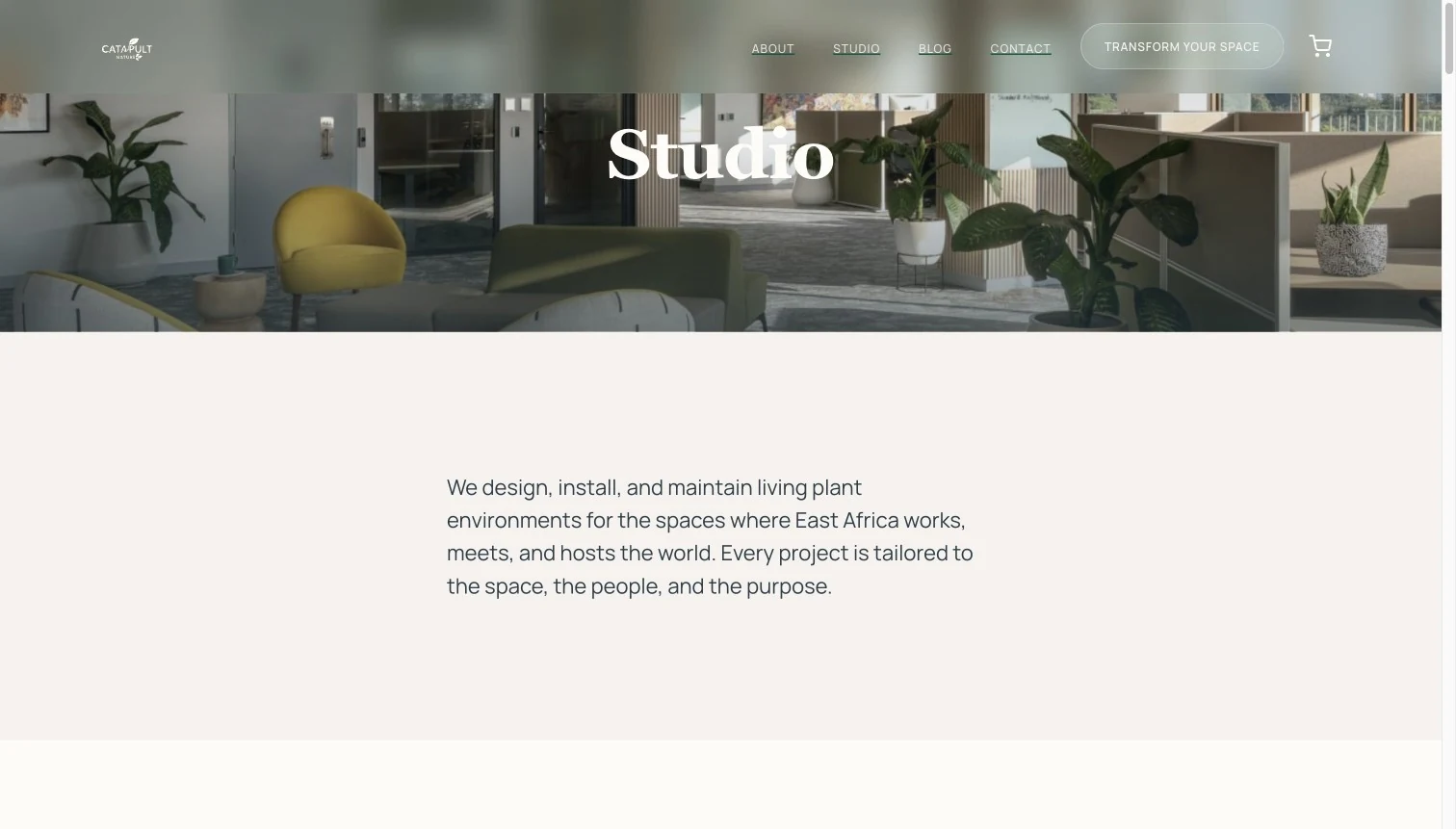
A Nairobi interior-scaping company, founded 2013, with clients from Google to Serena Hotels, needed its digital presence to match its physical work.
The engagement ran the full stack: brand identity from the mark outward, a drawn icon set, a tokenized design system, and a custom WordPress and WooCommerce site designed and built end to end.
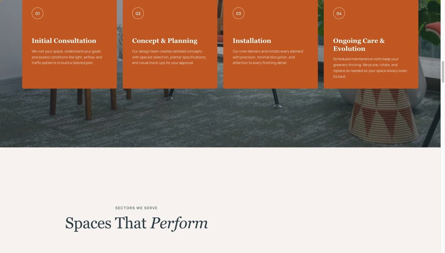
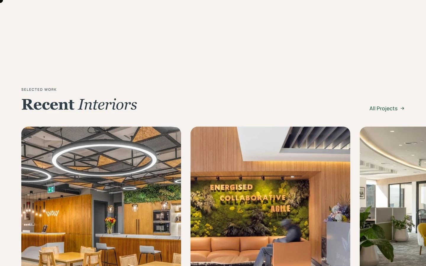
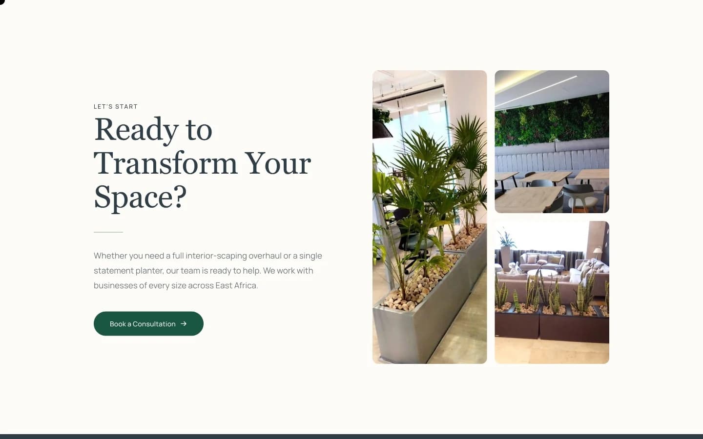
Every screen runs on the same tokens: cream grounds, deep forest bands, terracotta as a condiment rather than a wash, and motion slow enough to feel like the plants it sells.
What shipped
- Visual identity: brandmark, wordmark lockup, colourways and brand guidelines
- A drawn icon set covering the services and the contact points, built as vectors
- Editorial design system: Playfair Display and Manrope, WCAG-checked palette, motion language
- Custom theme with ACF-driven templates, e-commerce, and a full pre-launch content audit
- Catalogue and company-profile collateral built on the same system
Logo development
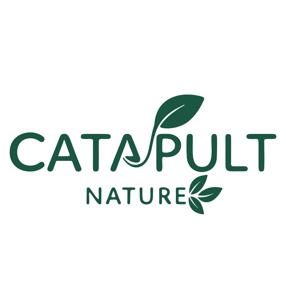
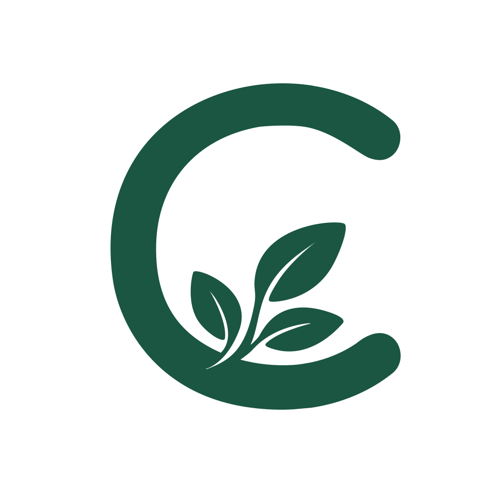
The brandmark is a C opened around a growing sprig, so the initial and the planting are one shape. The lockup repeats that sprig inside the wordmark, rising through CATAPULT and closing NATURE, which keeps the plant in the name at any size. Forest carries the mark; sage is the ground it sits on when the name is already present.
Iconography
Drawn rather than licensed: one weight of offwhite line on a sage disc, the same disc the brandmark sits in, so a services grid reads as one family instead of a stock set. The set runs past these four into the contact and social marks.